Painting the Plane as We Fly It: Designing JSR


It’s been about six months since we quietly open-sourced the JSR repository, a few weeks before Ryan announced it at DevWorld 2024. Since then, we’ve been thrilled to see the community embrace JSR, with over 240 additional contributions from more than 35 contributors outside of Deno (and that’s not even counting the tens of thousands of packages added to the registry).
From the first commit, we wanted JSR to be something the community could be a part of, helping drive feature development and interface refinements. But, as a designer, I wasn’t quite sure what that would look like for JSR.
Designing in the open and inviting external contributions requires checking your ego at the door. It can be uncomfortable to see people interacting with your “unfinished” work, but once you settle in, the process can be incredibly rewarding. It’s been exciting to watch JSR evolve over the last few months, and I wanted to pull back the curtain a bit on where we started, and where we hope to go with the JSR UI.
Picking a logo
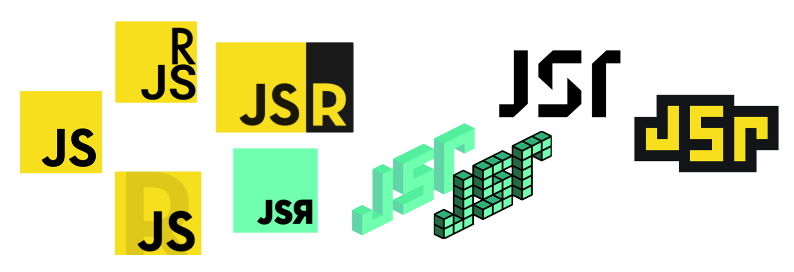
By July 2023 we retired the internal codename “registry3” and committed to the name “JSR.” Initially, we didn’t have anything but a name, and so we started from the logo. We (as designers) didn’t really know much else about the project at the time, other than the fact we were building a registry which was intended to be useful for all JavaScript users, and not just Deno users. We took some initial inspiration from the ubiquitous Unofficial JavaScript Logo by Chris Williams.
One initial suggestion was to take that iconic logo and somehow just squeeze an R in there somewhere. But after a bit of experimentation, we quickly realized that wasn’t the right approach.
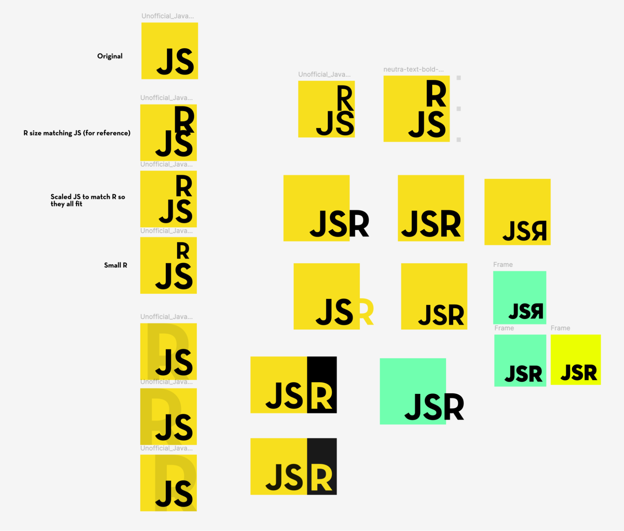
None of those ideas really felt right. For starters, there are already plenty of variants of that “JS” logo in the ecosystem, making distinctiveness a challenge. Besides: we didn’t want to risk giving the appearance of JSR being some kind of hasty bolt-on, or a JavaScript expansion pack; we wanted it to have its own visual identity.
So we set about exploring other options. Drawing from JSR’s role as a package registry, we started playing with the concept of “blocks,” to evoke a system composed of many smaller parts.
That’s also when the idea of an ambigram came to mind; that is, a logo that can be rotated 180° and still be the same shape (with the “J” turning into a lowercase “r” and vice versa); it was a design nod to the adding a package into your project however it happens to fit.
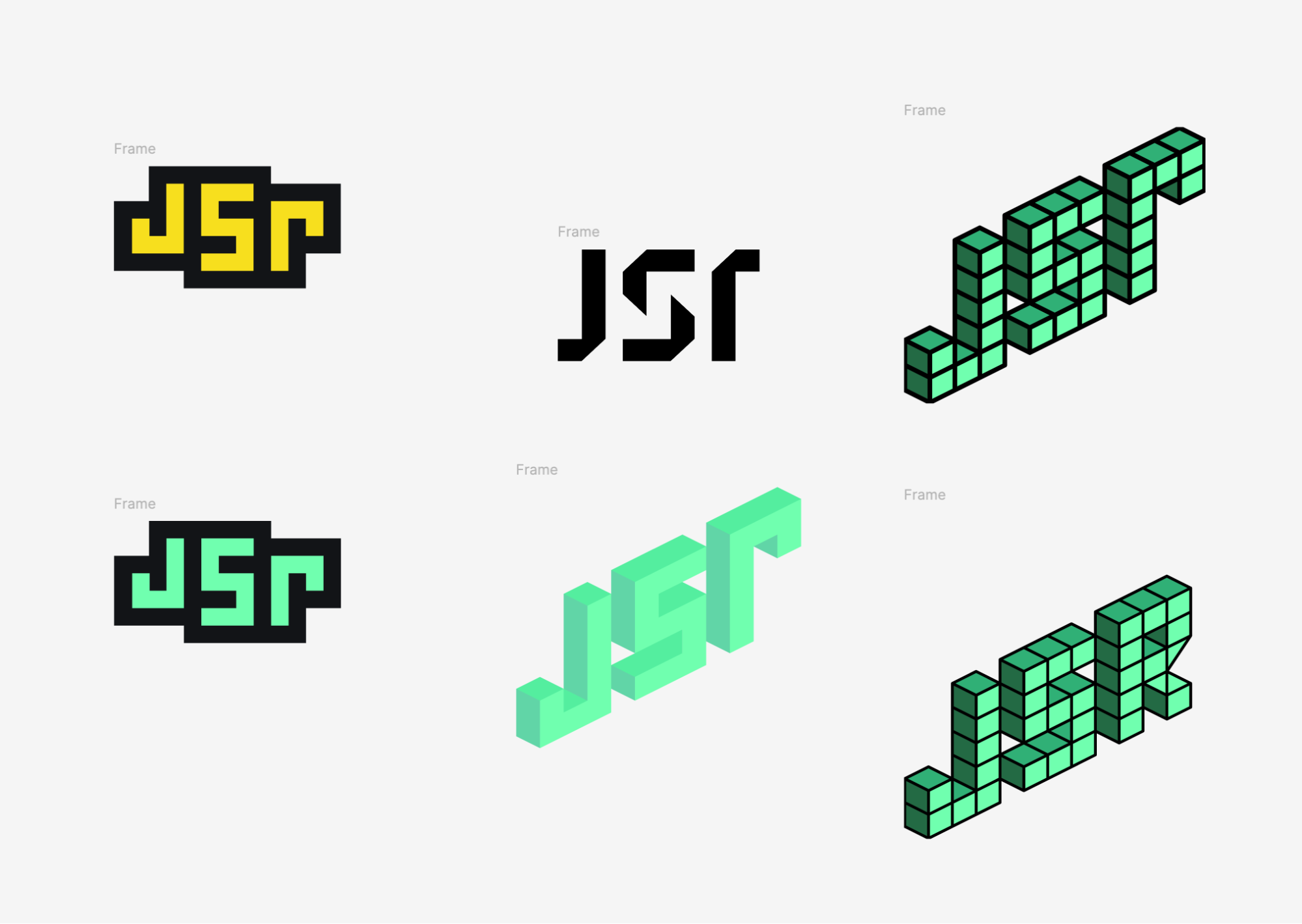
You might recognize the final JSR logo up there, but funnily enough, at the time, none of these ideas were meant to be the final logo. Josh Collinsworth, the designer of the logo (and one of the developers on the project) says this:
The concept that eventually became the official JSR logo was originally just a hurried sketch. I was trying out a bunch of ideas, drawing inspiration from projects I’d done during my time in design school, just to explore some possibilities.
By chance, that logo is the one the engineers decided to use as a placeholder, and they championed it. I was initially reluctant to crown it the winner, since I still saw it as a quick concept sketch. But the more we lived with it, the more its straightforward simplicity actually felt just right for the project.
So we had our logo… but we needed to come back to the color palette to finish things off, and ended up trading in that original dark brown for a more distinctive blue.
In the end, we landed on something that was simple, inspired by the most recognizable logo for the JavaScript language, and sufficiently “not Deno.”
Extending the logo influence
After finalizing the logo, our next step was to carry its design principles throughout the entire JSR interface. The logo wasn’t just a visual element; it set the tone for the product’s overall look and feel. We wanted the JSR app to feel cohesive and instantly recognizable to anyone familiar with the logo from conferences, social media, or our documentation.
We began by integrating elements of the logo into various parts of the page, starting with the homepage hero background, and eventually moving on to building out a consistent color palette to style the rest of the interface that could help our most important features shine.
Building the homepage header background
Let’s be honest: a search box is useful, but it isn’t very interesting. We wanted the JSR homepage to have something visually striking going on; after all, that’s many people’s first impression of JSR.
We explored a range of options, but the answer we settled on was a lightweight, open-source canvas library called particles.js. If you click through, there’s a good chance you’ll recognize it; it was a very popular effect on the web some years ago, back when Internet Explorer was still around. (The project dates back to 2014–2015.)
Naturally, when using a (once-)popular library, there’s always a risk of looking like a copycat, or out-of-date. But using particles.js felt less like following the modern crowd, and much more like reviving a classic in retro style. This is especially true since particles.js provides such a wide range of options for color, shape, speed, interactivity, and more, meaning we could make our implementation uniquely distinctive.
The end result is a fun effect that ties into both the JSR brand and the boxes motif, with some fun little interactivity baked in. Plus, it’s very performant, loading less than 10 deferred kB of JavaScript. (We should note, however: we did make some minor changes to the library, to allow us to pass a config object straight into the source code, rather than fetching and parsing a JSON file, in order to keep the number of moving parts as low as possible.)
Building a color palette from the logo
When we started building JSR we didn’t want devs to feel like they had to wait for visual design decisions to be made as they were building new features. We picked some standard Tailwind CSS colors we felt comfortable with, knowing that we could replace them later by modifying the palette in the Tailwind configuration or adding additional colors and performing a global find/replace on all the relevant Tailwind color classes.
Taking inspiration from the logo, I pulled the yellow and dark cyan and used a SaaS design tool called UIColors to start building a palette based on those colors.
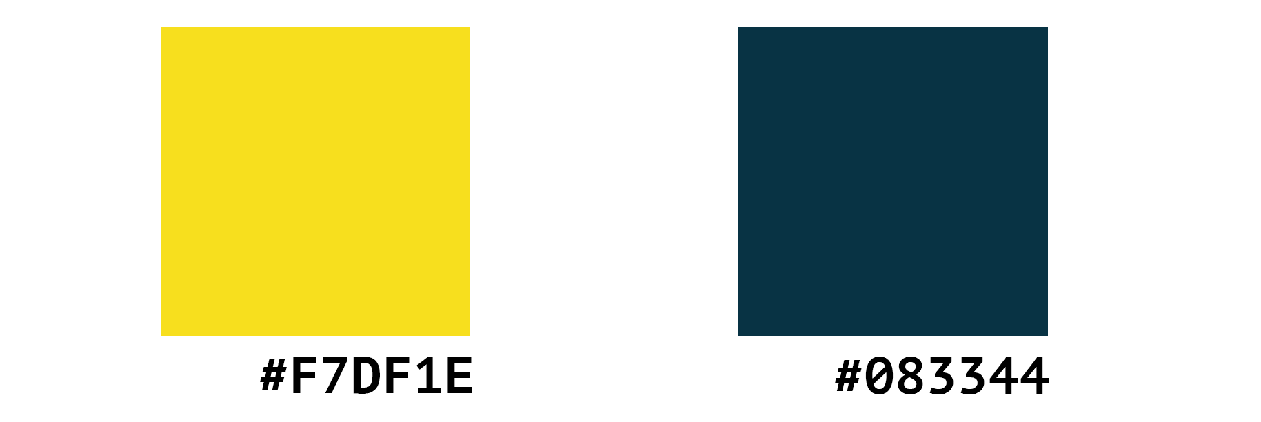
A standard Tailwind color palette usually includes about 11 variations of a color variable starting with “50” representing the lightest variant and “950” as the darkest. UIColors makes a best guess at where the color you present as your anchor color should fit on the scale allowing you to lock the anchor color and adjust lightness, saturation, and hue for the palette around it. The yellow we used in the JSR logo fit right in the middle of the scale and would become jsr-yellow-400 but the cyan was at the very end of the scale as jsr-cyan-950.
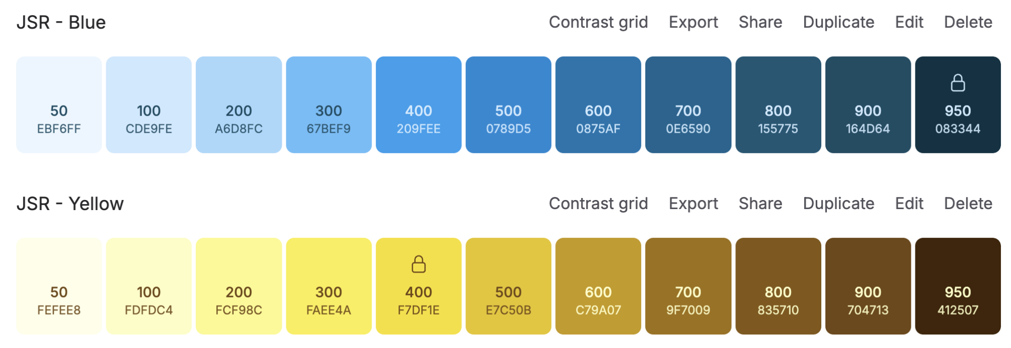
I then made some small adjustments to shift the scale in the direction based on how I thought the colors may be used in practice. I didn’t envision using a lot of yellow in the interface since it often has to take on a brown tone if you’re using it on text that you intend to be accessible. Recognizing that yellow would primarily serve as an accent color, I adjusted its hue and brightened the lighter end of the scale. For the cyan scale, I bumped up the lightness as well so I could use a lot of the colors on the lower end of the scale for borders and accents without distracting from the content itself. This approach allowed us to replace the initial gray tones with cyan shades, adding more character to the app while aligning it with the overall JSR brand..
This likely won’t be the last time we refine the color palettes, and defining them in a global configuration makes future changes straightforward.
One of the things the current palette struggles with is the fact that you kind of have to have a sense which color shades are compatible with each other and where they should be used. A lot of smart design systems will structure their color tokens in a way where designers can always trust that shades that are 3 or 4 steps apart will provide an accessible contrast ratio when used next to each other — like jsr-cyan-700 text on a jsr-cyan-300 background. This isn’t necessarily true of our current system so we have to rely on manual contrast accessibility checks when building new components. A standardized system would make it a bit easier for external contributors.
Applying the refined color palette
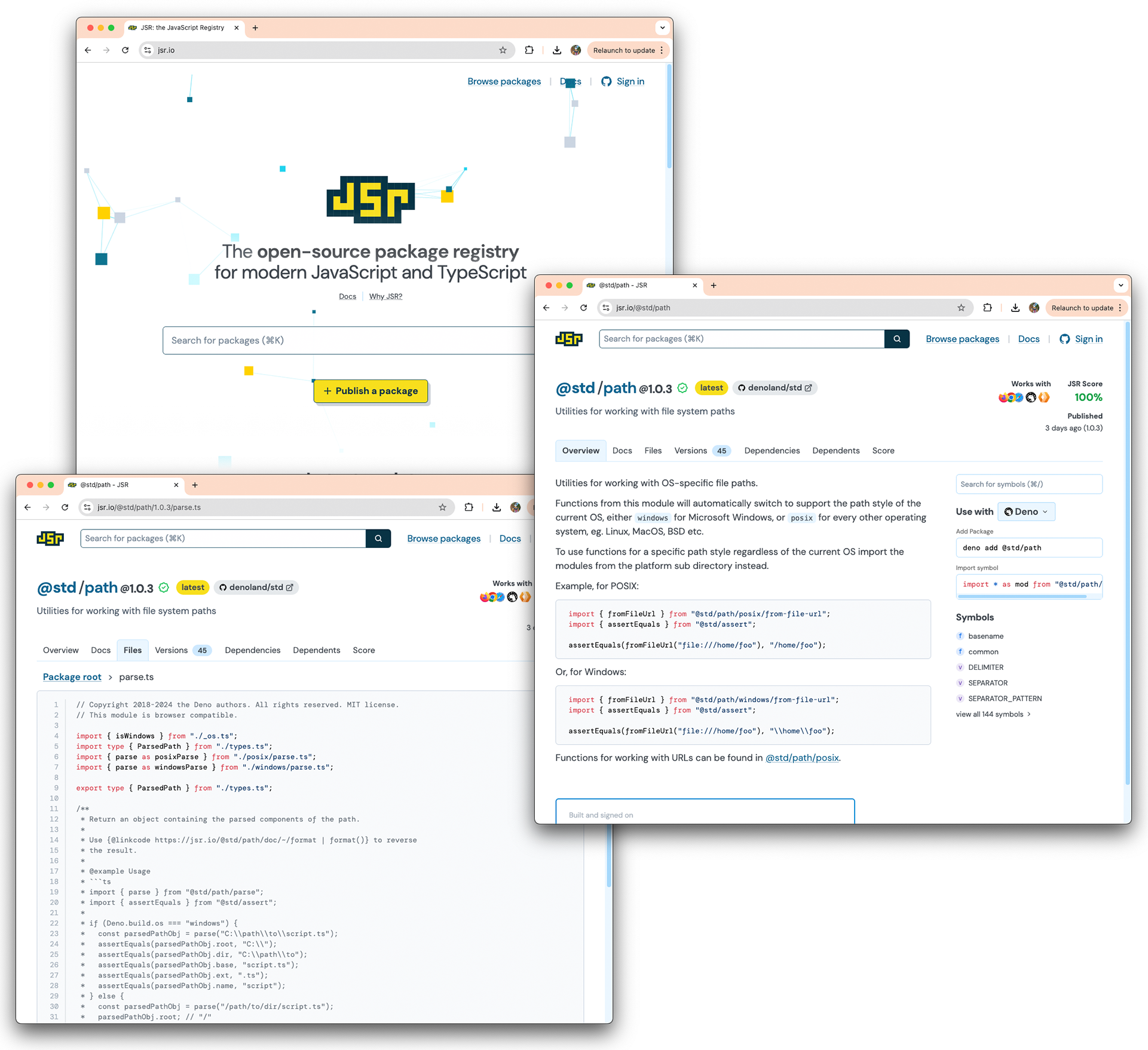
When it came time to apply the color palette to JSR, I spent some time thinking about the role that a JSR package page may serve in the JavaScript ecosystem. We wanted package pages on JSR to feel like they could be the official homepage for a package, freeing engineers up from building one-off marketing and documentation sites for each of their packages while still giving their users all the information they need to make informed decisions about how to use their code.
If we wanted authors to be able to treat these package pages as a homepage for their project (JSR auto-generates your documentation), we had to make sure that any sub-page linked within a package still felt like JSR, which meant maintaining a consistent brand identity even on sub-pages. Linking someone directly to a file in your package should feel connected to the experience of linking someone to a function or to your JSR score.
After building the refined color palette I combed through package pages and used our new palette to apply consistent border colors, font colors, highlights, and link styles ensuring that it felt like JSR no matter where you landed. After a few manual edits to figure out which colors needed to be converted to something in the new palate I was able to write some simple regular expressions to match instances due for conversion across the entire project. With dozens of changes queued up I was able to hit a very satisfying “replace all” button in VSCode and experience a new look and feel across the entire site.
Inviting community contribution
While the seed for JSR was being planted by the Deno team we always hoped for it to grow with community care. We were pleased to see that open-source contributors made several great additions to JSR in the first few months. The contributions ranged from small but necessary bug fixes like fixing table rendering and addressing empty states to fun enhancements like randomizing the logo animation, and even feature collaborations with our team like adding open graph protocol support to our package pages to help package authors more easily share their content.
We’d love to hear from you about what we can do to make it easier to contribute. Join our Discord or reach out via email at design@deno.com to share how we can make contributing easier for you.
What’s next
Exploring the design decisions of the overall brand — from the logo to how that translates to the website — is just the beginning.
In an upcoming post, we’ll dive deeper into the process behind designing the
package and documentation pages — specifically coming up with a reusable,
flexible design system to accommodate all varieties of
deno doc outputs. Stay tuned!